⁉️ What is BigBank?
PROJECT OVERVIEW
Background
BigBank is a small bank in Israel, which offers an online services of day-to-day actions in the bank, such as transfer money, check transaction history and order a credit card.
PRODUCT & UI/UX DESIGNER
My role
Product & UI/UX Designer - UX research, paper & digital wireframes, low-fidelity prototype, test low-fidelity prototype, high-fidelity prototype and test again.
THE BEGINNING
Problem
BigBank’s clients are struggling getting to the bank and manage things like credit cards or their own account. It takes time and frustrations to do so - nothing is online yet.
THE BEGINNING
Solution
Create a fully responsive website for BigBank’s clients. The user will login and begin manage his account by his own. He also has a live support with a banker if needed.

💫 Design process
🔍 Who is the user? What he wants?
💞 EMPATHIZE
Research findings
Swipe me! 👉
💞 EMPATHIZE
Research overview
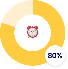
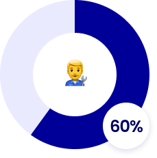
I conducted a quantitative research based on questionnaire I created about the experience with an online bank account management. I found out that almost every bank uses online services to provide fast and useful solutions to their clients. Also, people who has a full control of their online account are happier customers and secured.

💞 EMPATHIZE
User persona
David is a car mechanic living in Israel and is single. He’s saving money in his bank account but he’s frustrated from going to the bank and wait for the line or call the banker to manage things in his account. David needs a platform in which he can manage his account by himself. Based on the research, I created a user persona which represents a potential user who needs a solution for this problem he's currently facing.
💞 EMPATHIZE
User story
Based on David's persona I created a user story which focused me on the problem.

💞 EMPATHIZE
User journey map
User journey map helps us understand what is the path the user takes in order to complete a task. It allows us to see the flow from the user's eye and find the easiest solution for him.


🧭 Navigating creative solutions
🎯 DEFINE
Problem statement
David is a full-time employee who needs to be able to manage his bank account by himself and follow transactions because he wants to take full control of his financial life.
💡 IDEATE
Paper wireframes
I sketched these paper wireframes to find the best structure for the solution I am looking for. I came up with four different options and based my design on them.

💡 IDEATE
Digital wireframes
Moving from paper wireframes to digital ones made it easy to understand if I addressed the user’s pain points and improve the experience. I prioritized a call-to-action button to manage cards and see recent transactions right at the home page.

🛠️ Shaping experiences through testing
🧪 TEST
Usability study overview
I conducted a round of unmoderated usability study, for the low-fidelity prototype, so we can have a guide from potential users for the mockups.
Participants:
🙋♂️🙋♂️🙋♂️🙋♂️🙋♀️🙋♀️
Methodologies:
-
Unmoderated usability study.
-
Users were asked to perform tasks on a low-fidelity prototype.
-
15 minutes per participants, in Israel, remote.
🧪 TEST
Study details
Tasks:
-
How do you know how much money do you currently have? How was it to figure this out?
-
If you need help, where would you go?
-
Describe your transaction history in your own words.
-
What kind of cards do you have? What if you need another one?


🧪 TEST
Insights identification
-
Based on the theme that most users struggled to navigate the app easily and smoothly, an insight is users need to have a smooth navigation to all the pages of the prototype from anywhere.
-
Based on the theme that most users had difficulties with assigning date and time of the booking, an insight is users need to have the best way to toggle between date and time and to rewrite it if needed.
-
Based on the theme that most users get too confused with the information at many occasions, an insight is users should have the information they need prioritized and organized as well as the navigation.
🧪 TEST
Patterns identification
3/5 struggled to navigate the app easily and smoothly.
3/5 said that date and time should always be toggled in order to make changes when needed.
2/5 could not get to the home page and complete the task.
🎨 Crafting stories through design
📲 PROTOTYPE
Visual & UI design


📲 PROTOTYPE
Prototype & design system


📲 PROTOTYPE
High-fidelity prototype (UI & design system)
UI Design | Interaction Design | Visual Design | Design System | High-Fidelity Prototype


